The internet collectively vomited over the new Manchester City away kit
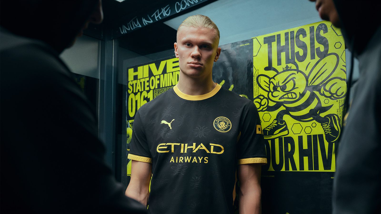
Puma has finally done it, folks. They managed to take the industrial soul of Manchester, turn it into a literal insect theme, and slapped a 80 pound price tag on it. Manchester City’s away kit for the 2026/27 season features a pattern inspired by the worker bee, an icon of the city that apparently belongs on a hive, not a Premier League pitch.
The reactions on the forums are exactly what you’d expect from a fanbase that has lived through decades of questionable fashion choices. It is a total bloodbath. Some fans are acting like this kit represents the city's heritage, while others are convinced the designer was having an actual medical emergency during the creative process.
The "heritage" stans vs. the reality check
You have the people who think anything with a bit of local history is a masterpiece. One poster on a popular blue-side forum claimed the bee design is a brilliant nod to the city’s post-industrial resilience. I love local history, but just because a symbol is historically relevant doesn't mean it needs to be plastered in weird, hexagonal patterns across a player’s torso.
Then you have the logic of the realists. They point out that City has been chasing the sleek, minimalist look for years, and this is a jarring, neon-splattered departure from form. If you look at the official kit roundup, you’ll see some clubs are playing it safe, while Puma is clearly testing how far they can push the aesthetic envelope before fans riot.
Why the kit is a swing and a miss
My hot take? It’s a classic case of over-designing. Football shirts are meant to be worn in pubs, at matches, and sometimes even at the gym if you’re brave enough. This bee disaster looks like a high-vis jacket met a honeycomb. It fails the most important test: does it look good when a player is sweating buckets in the 88th minute of a Champions League knockout game?
Critically, the implementation is just messy. The contrast between the team crest and the chaotic background pattern makes the whole thing look like a poorly rendered texture in a decade-old video game. It forces you to wonder if the brands are just throwing darts at a mood board at this point.
Is it the worst design this year?
Look, I’ve seen some horrors in the Premier League. Remember the weird camo patterns from a few years ago that made defenders look like they were phasing out of reality? This isn't that bad, but it is certainly in the top three of most distracting designs of 2026. The shift toward weird, granular textures is a trend I want to see die yesterday.
The skeptics are winning this debate for a simple reason: functionality. Supporters want something clean that makes them feel like part of the squad. Nobody wants to look like they’ve been mauled by a swarm of bees in the middle of a swarm. Puma should have stopped at the subtle badge accents instead of going full nature documentary.
The verdict on Puma’s creative choices
At the end of the day, people will buy it because they’re fans. That doesn’t change the fact that the design is a massive swing and a miss. It lacks the gravitas of a title-chasing club. If City wins a trophy in this thing, it will be in spite of the jersey, not because of it.
There is a strong argument that football kits are moving away from being "sports gear" and toward "fashion accessories" that don't satisfy either category. You’re trading performance aesthetics for social media engagement, and this kit is the perfect example of that bargain. It’s loud, it’s unnecessary, and I’m going to spend my entire weekend roasting it in the discord.
We need to demand better. When you're paying nearly a hundred quid for a shirt, it shouldn't look like an accidental experiment. Let’s get back to bold colors and logical patterns, or just admit that the kit designers are bored and trying to troll us for viral engagement metrics.